

Learning how to build an affiliate landing page without writing a line of code takes one page, one offer and a builder you can drag blocks around in. You do not need a developer, a theme overhaul or any HTML. You need to decide what the page is for, put the parts in a sensible order, and tell the visitor honestly that you may earn a commission.
I am a senior travel blogger and an affiliate marketing website builder, so the walkthrough below uses a travel offer as its example. The same structure works for any niche.
What a landing page does that a blog post does not
A blog post is built to answer a question and keep the reader on your site. It has a menu, a sidebar, related posts, an author box and links to other articles. Every one of those is a way out of the page, and for a post that is fine, because the goal is to be useful and to be found.
A landing page has ONE job. The visitor arrives, understands what the offer is, and either clicks the button or leaves. Because the page has a single purpose, everything that does not serve it gets removed.
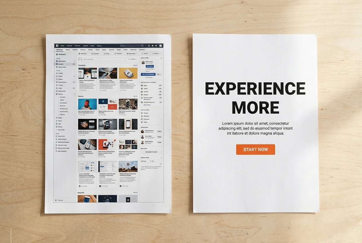
Blog post | Landing page | |
|---|---|---|
Goal | Inform, rank in search | Move the visitor to one action |
Navigation | Full menu, sidebar, related posts | Logo only, or nothing |
Links | Many, to other posts and sources | The offer link, repeated, plus legal links |
Length | As long as the topic needs | As long as the decision needs |
Blog posts and landing pages work together. A post can bring in readers who are researching, and the landing page gives the ready ones a clear place to go. This article covers only the page they land on.
Pick ONE offer and ONE action before you touch the design
Most weak landing pages are weak before any design happens. They promote three hotels, two tour companies and a travel card on the same page, so the visitor has nothing obvious to do.
Choose ONE affiliate offer. A few checks before you commit:
- You would be comfortable recommending it to someone you know.
- The program’s terms allow you to promote it on your own page. Read them, because some programs have rules about wording, trademarks and where links may appear.
- The merchant’s own page is clear and works well on a phone, because that is where your visitor lands next.
- The program has a reliable payout record. If you have not chosen a network yet, how I judge travel affiliate networks by payout reliability and brand reputation covers the checks.
Then choose ONE action. For a landing page, the action is nearly always a click on a button that takes the visitor to the merchant’s page. Not “read more”, not “follow me”, not “sign up for updates and also click here”. If you want an email subscriber from the same visitor, that is a different page with a different job.
Write one sentence that states what the page is for. For example: “This page helps travellers over 60 compare travel insurance options for a trip abroad.” If you cannot finish that sentence for your own offer, the page is not ready to be designed. Keep the sentence nearby, because every later decision gets checked against it.
Build the page in a no-code builder: the sections in the order I place them
Use whatever visual builder your site already has. A block editor, a drag-and-drop page builder or a landing page tool will all do. What matters is the order of the sections, because a visitor reads from the top and decides at each step whether to continue.
Here is the order I place them:
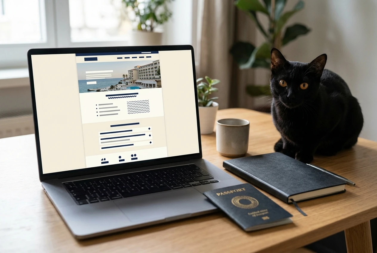
- Simple header. Your site name or logo, linked to the home page, and nothing else. No full menu.
- Hero section. The headline, one supporting sentence, the button and one relevant image. This is the part visitors see before any scrolling, so it has to work alone.
- The problem or the need. Two or three short paragraphs describing what the visitor is trying to do and what makes it hard. Write it from what you know about your readers, not from invented stories.
- What the offer gives them. A short bulleted list of features and benefits. Take every detail from the merchant’s own page. If you do not have a price, a discount or a spec in writing from the merchant, leave it out of your page.
- Who it suits and who it does not. Two short lists. Telling a visitor honestly that an offer is wrong for them makes the rest of the page more believable.
- Proof. Only real material: your own experience if you have used the offer, clearly labelled, or facts you can point to. Do not paste in testimonials you cannot source.
- Second button. The same wording and the same colour as the first, placed after the visitor has read the case.
- Short FAQ. Three to five questions visitors actually ask, answered with facts from the merchant’s terms.
- Disclosure and footer. Your affiliate disclosure, plus links to your privacy policy and contact page.
Keep the page to one column. Multiple columns look busy on a desktop and collapse unpredictably on a phone, and a single column forces you to put the parts in a deliberate order.
Clean design rules: spacing, one font pair, one button colour
Clean design on a landing page comes from restraint. You do not need design talent, only three rules.
Give everything room. Put generous padding above and below each section, and leave space between a paragraph and the button. Crowded pages make visitors tired, and tired visitors leave. Keep body text at 16 pixels or larger, and keep lines short enough that the eye does not have to travel far across the screen.
Use ONE font pair. One font for headings and one for body text is plenty. Pick a pair your builder already offers and stop. Mixing in a third font for a quote or a decorative line makes the page look less trustworthy, not more.
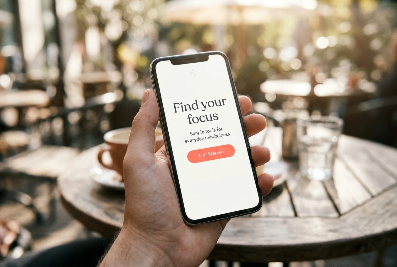
Use ONE button colour. Choose a colour that contrasts clearly with your background and use it ONLY for the button. If the same colour appears in headings, icons and borders, the button stops standing out. Both buttons on the page should match exactly.
A few smaller points help as well:
- Use one image, relevant to the offer, and compress it before uploading so the page loads quickly.
- Make sure text has enough contrast against its background, especially on top of photos.
- Align text to the left. Centred paragraphs are harder to read.
Write the headline and button text so the next step is obvious
The headline should name the visitor’s outcome in plain words. Compare two versions for the travel insurance example:
- Weak: “Welcome to My Travel Page”
- Better: “Compare Travel Insurance Options Before Your Next Trip Abroad”
The first tells the visitor nothing about what they can do here. The second says what the page is about and who it is for, in one line.
The supporting sentence below the headline adds one concrete detail: what the offer is and what the visitor does next. For example: “Use the provider’s comparison tool to see options for your trip dates and destination.” Only write that if the merchant’s page really works that way.
The button text should say what happens when the visitor clicks. “Click here” and “Submit” tell them nothing. “Compare options on the provider’s site” tells them they will leave your page and what they will find. Visitors who know where a button leads are more willing to press it.
Avoid urgency you cannot back up. Do not write “Offer ends soon” unless the merchant states an end date in writing, and then use their wording. Invented scarcity damages trust, and it can break the program’s terms.
Add trust and disclosure so visitors feel safe clicking
A visitor who arrives from a search or a social post knows little about you. A few visible signs show that a real person runs the page.
- Your name and a short line about who you are. Use only facts that are true and that you are comfortable publishing. For example, you can say you are a travel blogger who writes about travel for seniors, if that is what your site does.
- A link to your About page. Visitors who want to check you out should be able to do it in one click. Mine is at About Me.
- Privacy policy and contact links in the footer.
- Accurate claims. Everything about the offer should match what the merchant publishes.
Then the disclosure. Put it where the visitor sees it near the button, not only in the footer. Write it in plain words: “If you buy through the link on this page, I may earn a commission.” Add “at no extra cost to you” ONLY if that is true for this offer, which you can confirm in the program terms.
Many countries require clear disclosure of affiliate relationships, and most affiliate programs require it in their terms. Check the rules where you live and the rules of the program you joined. A clear, early disclosure also protects you: visitors who know how you earn money tend to trust you more, not less.
For a broader look at keeping the whole site safe, see how to build a business website safely.
Check the page on a phone and test the link before you publish
Many visitors will see the page on a phone, so check it there first. Your builder’s mobile preview is a start, but also open the real page on an actual phone once it is saved as a draft or published with a private link.
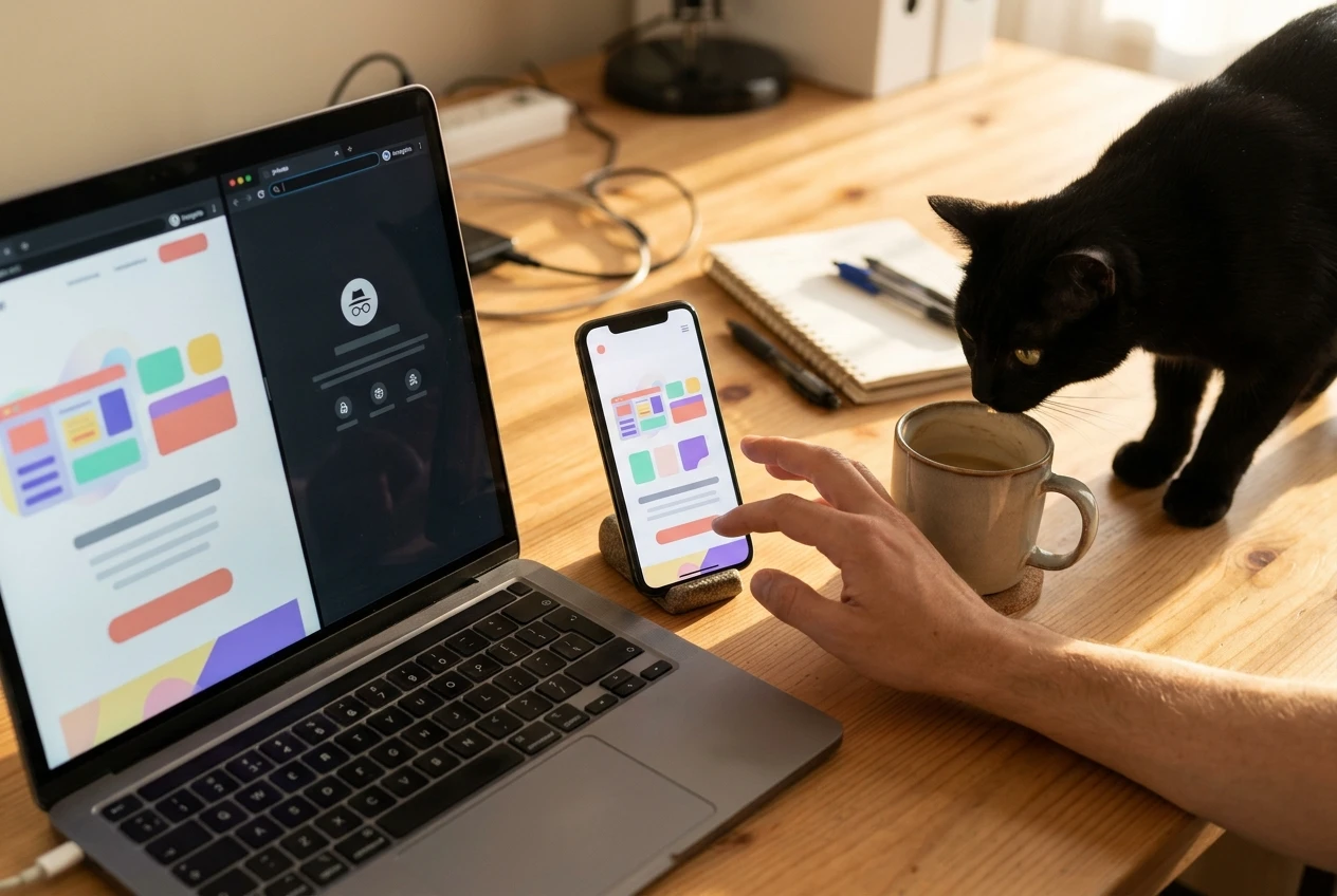
Go through this checklist:
- The headline and button are both visible without much scrolling.
- Text is readable without zooming.
- Buttons are large enough to tap with a thumb and are not crowded against other links.
- Images do not push the text down or leave blank gaps.
- The disclosure is visible near the button.
- The page loads quickly on mobile data, not only on your home wifi.
Then test the link itself. Click each button in a private browser window, the way a new visitor would, and confirm that it opens the right merchant page. Check that your affiliate tracking parameters are still in the address after the redirect. If the link strips them, your commission may not be recorded, so check before you send traffic. Test the second button separately, because it is easy to paste a different link into each one by mistake.
Finally, read the page aloud once. Typos, a missing word in the headline or a broken sentence are easy to spot when you hear them.
What to look at after launch, and what to change first
Give the page time to collect visits before you judge it. A handful of visitors tells you nothing, so avoid changing things after the first few clicks.
Once it has real traffic, look at three things:
- Where visitors come from. Search, social and direct visitors behave differently, and a page that suits one group may not suit another.
- How many click the button. Compare the clicks recorded by your analytics with the clicks your affiliate dashboard reports. If they differ a lot, check the link.
- How far visitors scroll. If most leave before the first button, the top of the page needs work.
Change things in this order, ONE at a time:
- The headline first. It is the first thing every visitor reads, so it has the biggest effect on whether they stay.
- The button text second. Make it clearer about what happens after the click.
- The section order third. Move the proof or the FAQ and see whether more visitors reach the button.
Changing one element at a time lets you tell which change made the difference. If you change everything at once, you will not know what worked.
Your next step
Pick one affiliate offer you already trust and build its landing page this week using the section order above. Once the page is live, read my post on turning visitors into email subscribers to plan what happens after the click.